
Art Direction + Design
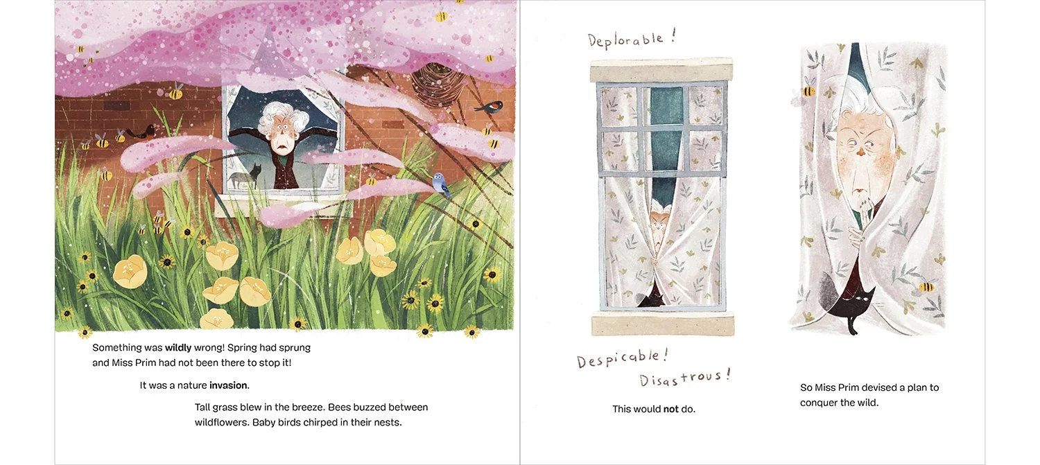
The author, Katy Rose wrote such a beautiful story! This touching, funny, and surprising Picture book is centered
around a grumpy curmudgeon who discovers the power of Nature, and the community it can bring.
Some illustrators are just a dream to work with, and Phuong Thai is one of those!
She was far and away my favorite out of the illustrator options we gave to Editorial and Author, and happily, we we all in agreement.
So receptive to feedback, so talented, so amazing at lettering, SO CREATIVE!
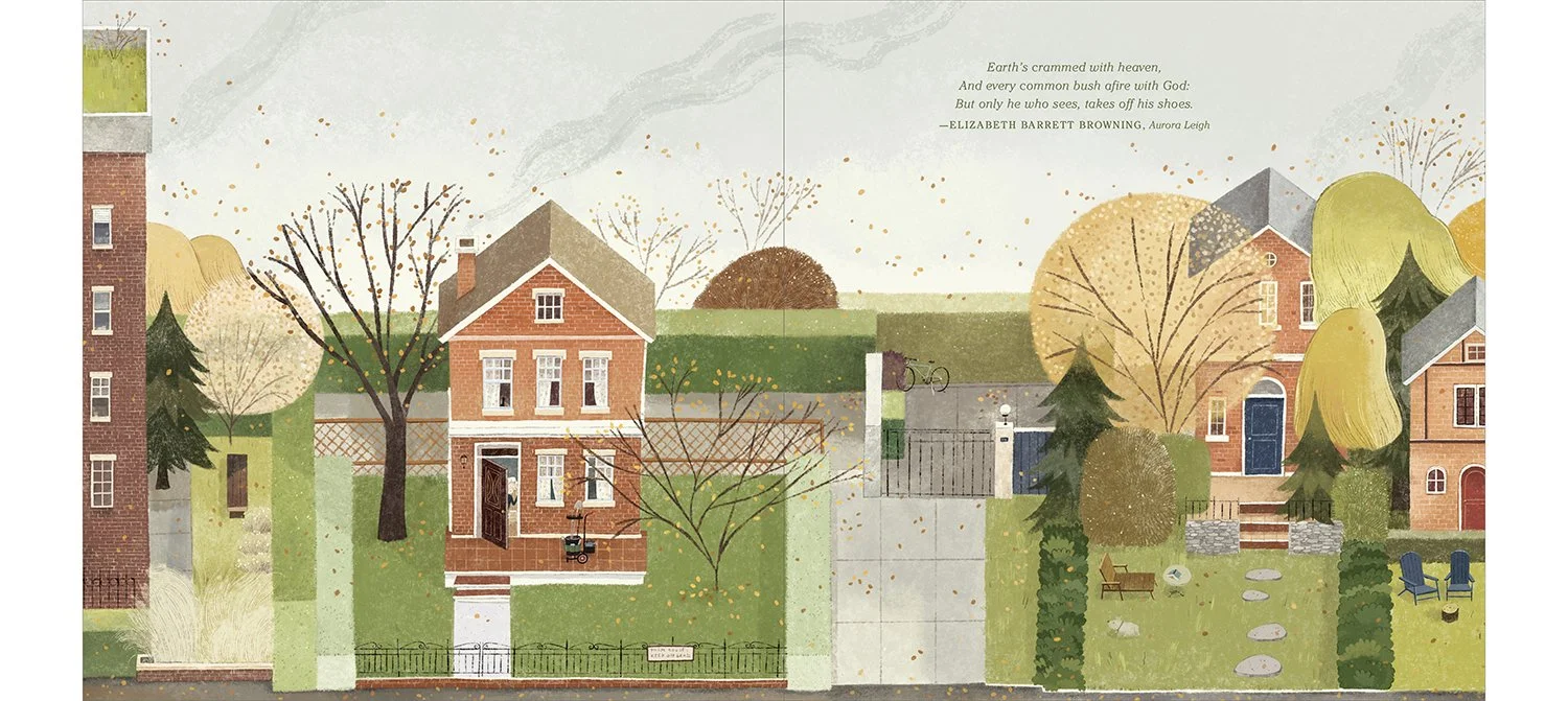
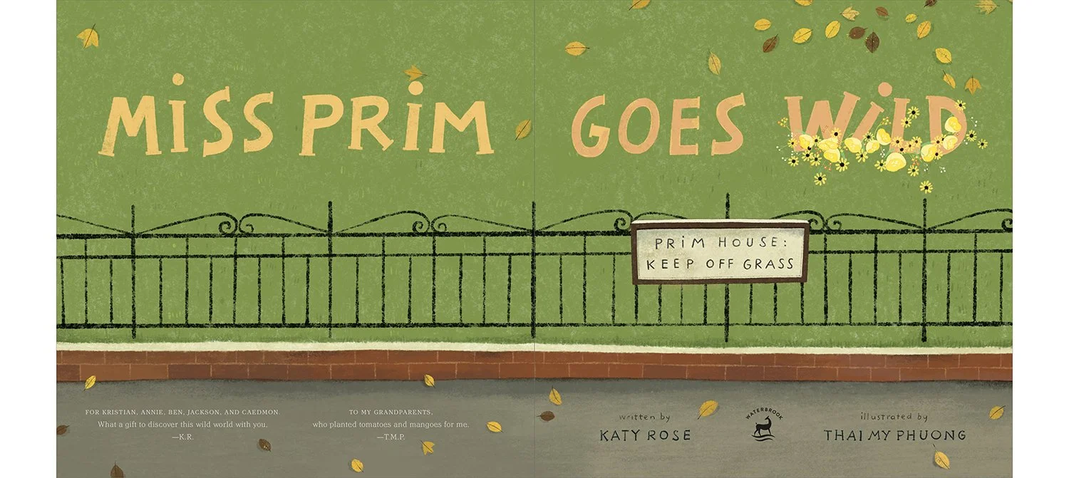
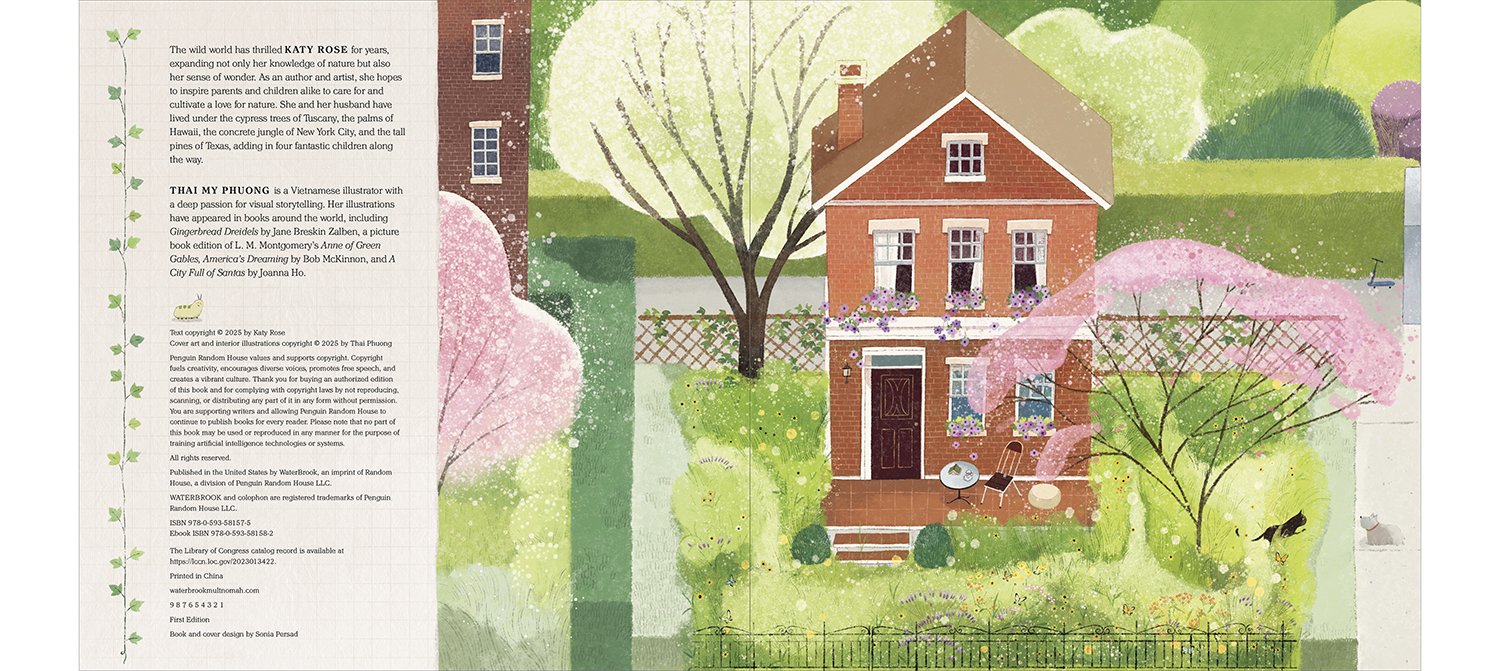
The front matter and back matter ended up being one of my favorite parts of this book. The Title Spread
EDITOR: Kim Von Fange
CREATIVE DIRECTOR: Marysarah Quinn + Jenny Davis

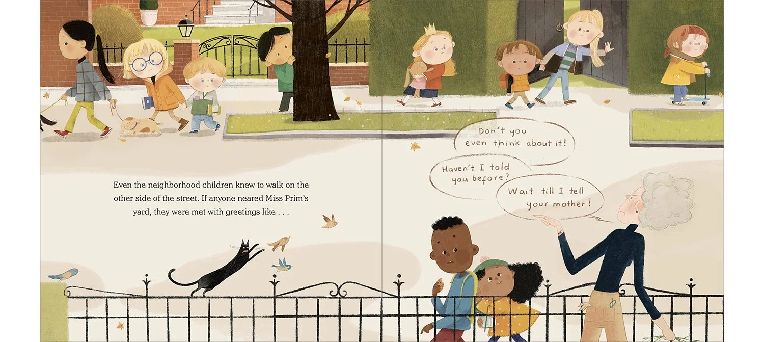
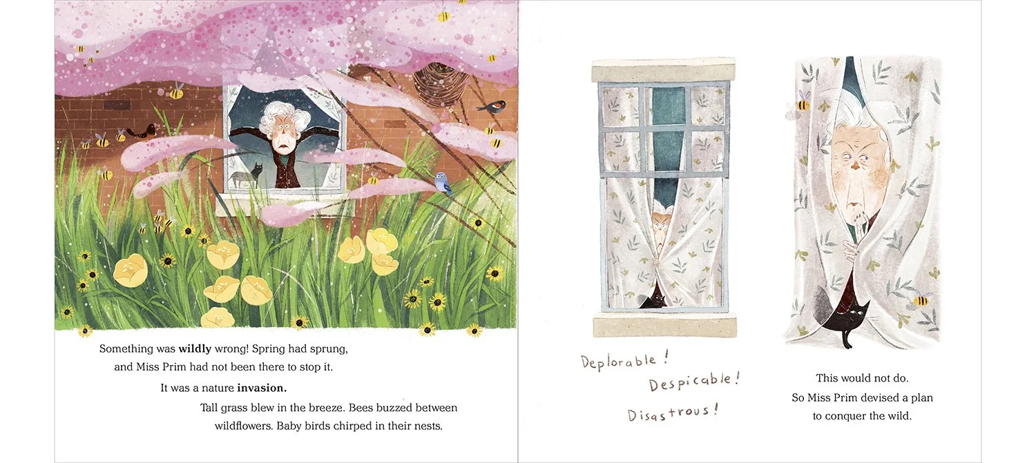
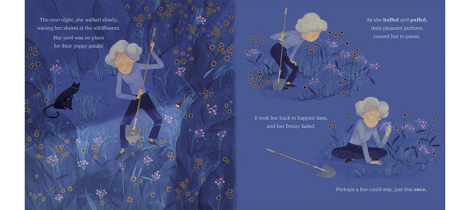
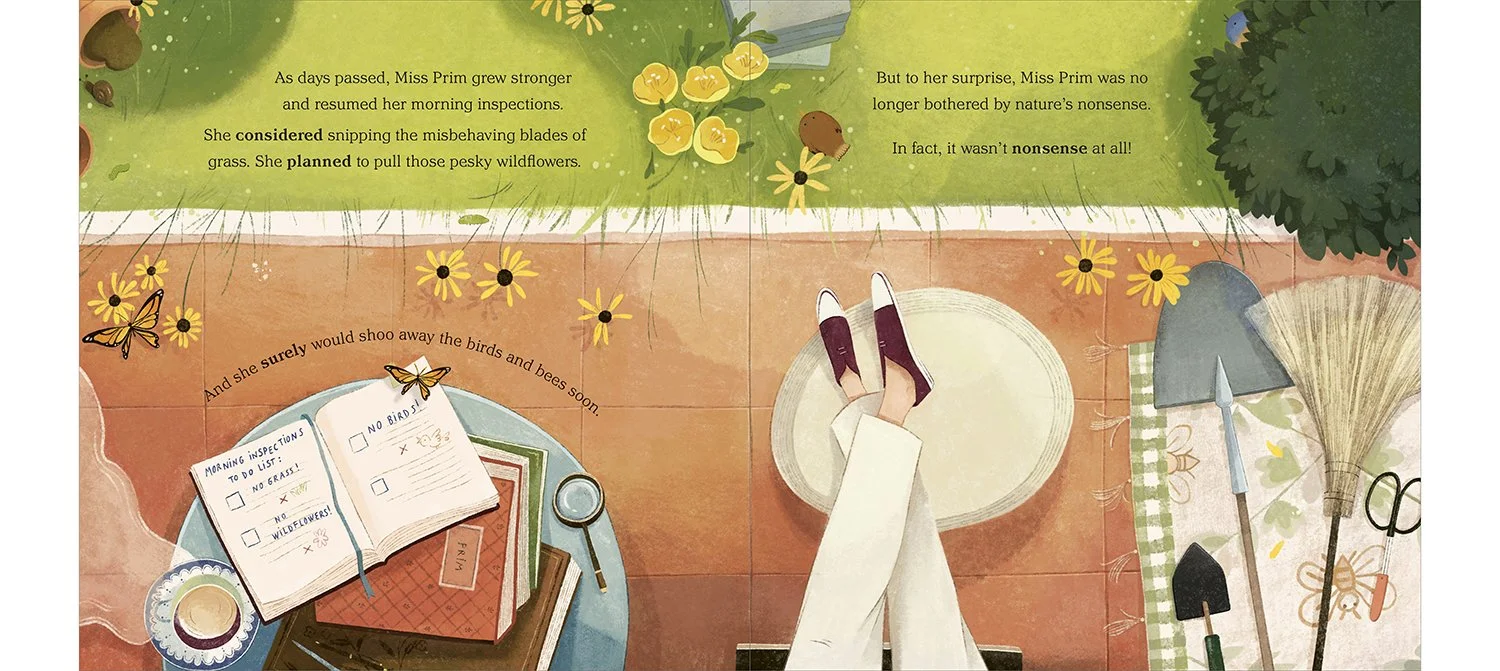
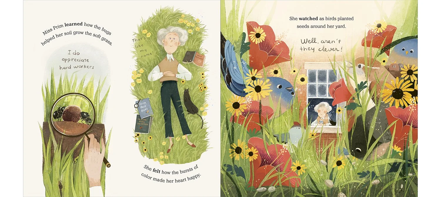
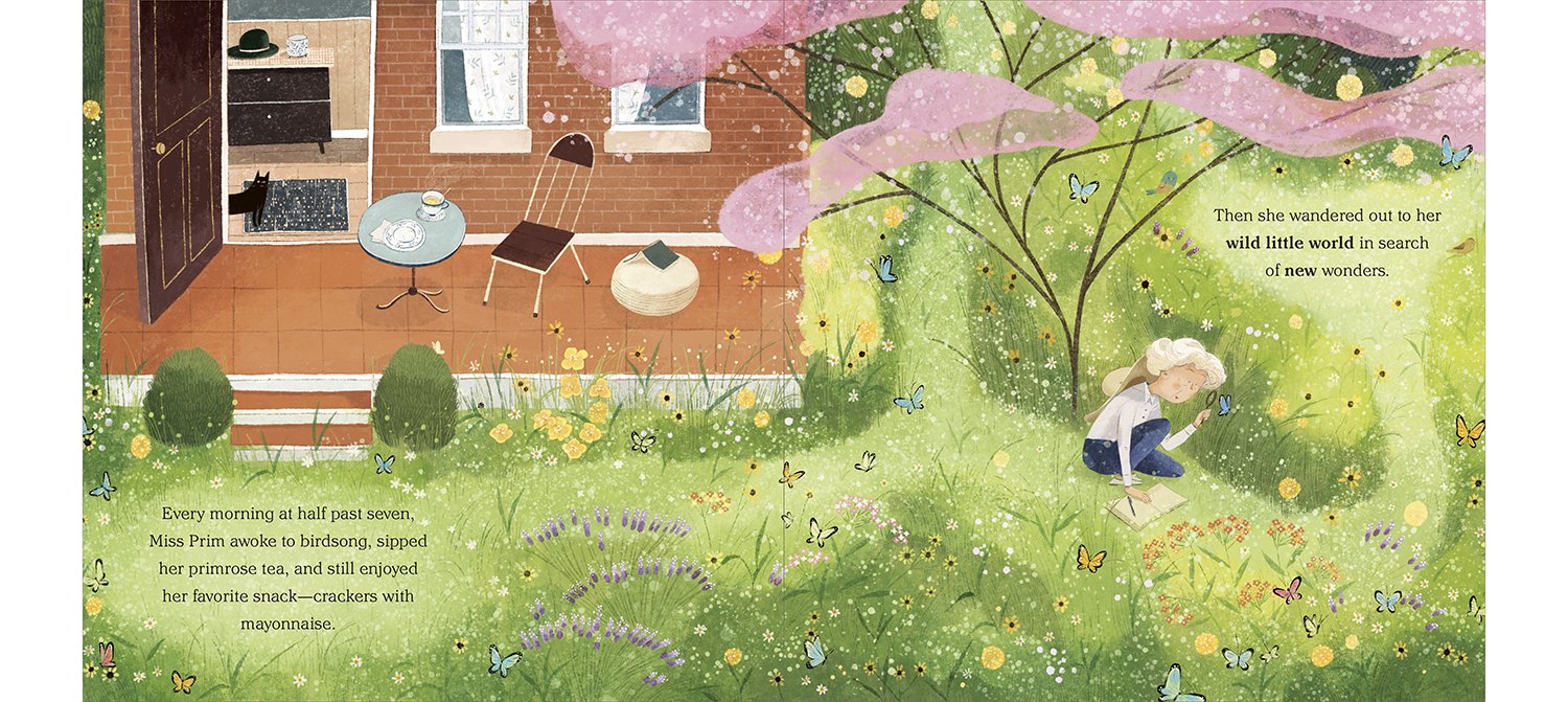
Some of my favorite interior spreads!
The Title Spread came to me late in the game (before this, we had a too-staid + white teacup).
I felt that we needed to emphasize Miss Prim’s grumpiness from the outset and Photoshopped the title into something dramatic . . .
thankfully Kim + Phuong got it! and I loved how it transformed the pacing and gave the narrative extra OOMPH.
The ending spread was one of the hardest to Art Direct…I kept saying ‘More, more!’ and ended up Photoshopping like crazy
to show how we could also achieve readability for the type. We got there!
Bonus: Designing Concepts
Concepts is one of the most important building blocks of a successful book design.
I consider palette, type rendering on dark and light, glyph availability, typographic history + appropriateness,
and hope to use robust fonts families…shocking numbers of kid’s fonts don’t feature italics or multiple weights.
….Don’t get me started…
Main font: Mija


Main Font: Pasquale


